My Portfolio

This work is the product of eight years of honing my creative vision in styles of photography, design and various writings. Below you’ll find some of my standout pieces and their provided context for further in-depth pieces. I have also curated a separate section for my essays and writings for potential employers to explore.
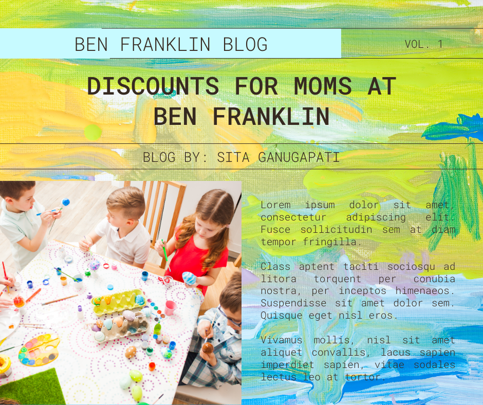
For COMSTRAT 563 Professional Digital Content Promotion. I created a portfolio that contains promotional plan for a campaign for art store Ben Franklin. I was alone in this project. That portfolio contained three creative concepts this was the one I got the best scores on. It took two days of design as I sketched on the concept and used Canva to design my project. I wanted an artistic background to this process. This blog post was a creative concept used as part of the development of a promotional package for one of my classes. The concept was made from the idea that outreaching to kids, you must outreach to the parents. I wanted to create something simple but eye-catching. I chose bright colors with dazzling emphasis. I almost went in a more orange direction but instead leaned away from bright colors and kept with cool green. This was the project that established a new standard for my work. The overall challenge was to create a poster for a place that does not structure itself for events. A challenge I had set for myself was finding canvas limits and I did not find them, but I ended up creating a piece of work I am truly proud of.
COM 561,Professional Multimedia Content Creation, I needed to create a logo for a fake advertisement. My role was creator and designer for this project. The logo depicts a bead supplier store. As the designer I wanted to create something elegant with artistic script. I went with a cursive design. To emphasize the artistic and creative vision behind it. This was part of a video creation project this logo was created in InDesign using principles learned in my multimedia content creation class. The steps I took were opening InDesign and using typography, color and style to create an idea of rolling beads. I had to make a few concessions due to time but ultimately, I like how simple the vision ended up looking. I learned to give myself more time for the sketching and the initial design phase since this was done in an hour. I think originally, I planned for was tossed but I was able to demonstrates success or forward progress – even if milestones and goals were not fully achieved. The logo to be sitting in a giant bead but ultimately it would’ve taken too much time.
For my Com 561 professional multimedia content creation class. This was an invention using principles learned in my multimedia content creation class. We used color editing and saturation to boost the quality of the image. I also crafted the logo seen in the image myself. We had two weeks to finish our general layout. The original project was seven of the piece layout, but this is just a screenshot of the Facebook advertisement that I had cultivated as part of the assignment. My professor provided feedback and ultimately the final project as you can see turned out very polished. My peer criticism said I had left too much white space, so I took the criticism and took new photos which showed a large variety the color was ultimately changed to pink and blue to match the frosting. The first lesson I learned was don’t be afraid of expanding your concept as a designer. My second lesson learning how to use alignment in photoshop was always a weak point for me but this project allowed me to grow and become a better designer.
For Com 486 our graduate level crisis communications course, we had to create a crisis communication plan to raise awareness. My choice was to create theoretical work for a known charity such as direct relief to present a theoretical crisis communication plan to them. The elements of the task were built of the design for my graduate crisis communication course where we had to create a series of promotional material bent on raising awareness. The steps I took were based on layering finding the perfect common uses images through Canva and forming the words to create a fear/ guilt appeal about donations. This was easy since I’m very familiar with the charities’ work. This was an individual project all contributions were mine. This was made quickly and simply with prewritten messages of my own design.
The scope of the survey in the image is based on my Consumer and Brand Insights class projects. I stayed within the imaginary budget given for this class and focused on creating a brief seasonal blitz for this campaign. pathways that did not pan out. The survey was ten questions, and designed questions targeted at young women who typically shopped for bras. The survey ran for 1 week and we ended up just short for a little bit for a convenience sample. I was able to extrapolate the data, about all of the responses reported that they had a ill-fitting bra. The biggest single lesson I learned was that surveys require time and manpower and that I have neither. I did learn a lot more about data analysis and using google sheets to create graphs.


